Nomi Matcha Cafe — branding project
Nomi Matcha Cafe is a concept for a hip, minimalist café specializing in matcha-based beverages. The brand identity draws inspiration from Japanese tea rituals combined with modern, urban aesthetics. The project merges natural motifs with a “taste laboratory” concept — embracing the idea: simple, green, modern.
Software
Role
Scope

Project type


Project Goal
The goal of this project was to create a cohesive, modern, and Instagram-friendly brand identity for a minimalist matcha café. The brand needed to reflect both the natural, calming qualities of matcha and the experimental, “lab-like” vibe of the café, while appealing to a young, urban audience. I was responsible for the full branding process, including naming, visual identity, menu design, merchandise, and mockups.

The main audience includes 18–35-year-olds, urban dwellers, students, and young professionals. They value design, lifestyle, and alternative café culture. The café is a space for both relaxation and daily rituals, from working on a laptop to social gatherings, and appeals to those who appreciate minimalism, high-quality ingredients, and aesthetically pleasing spaces.
Target Audience
The branding project includes a cohesive set of visual materials:
Logo in Warm Yellow on a frothy matcha background — the primary brand mark.
Menu in a double-sided layout: front in Warm Yellow, back in Deep Matcha Green with logo only.
Cups and cup holders in café colors with minimalist prints.
Fabric awning mockup featuring the café logo — part of exterior branding.
Window stickers displaying opening hours.
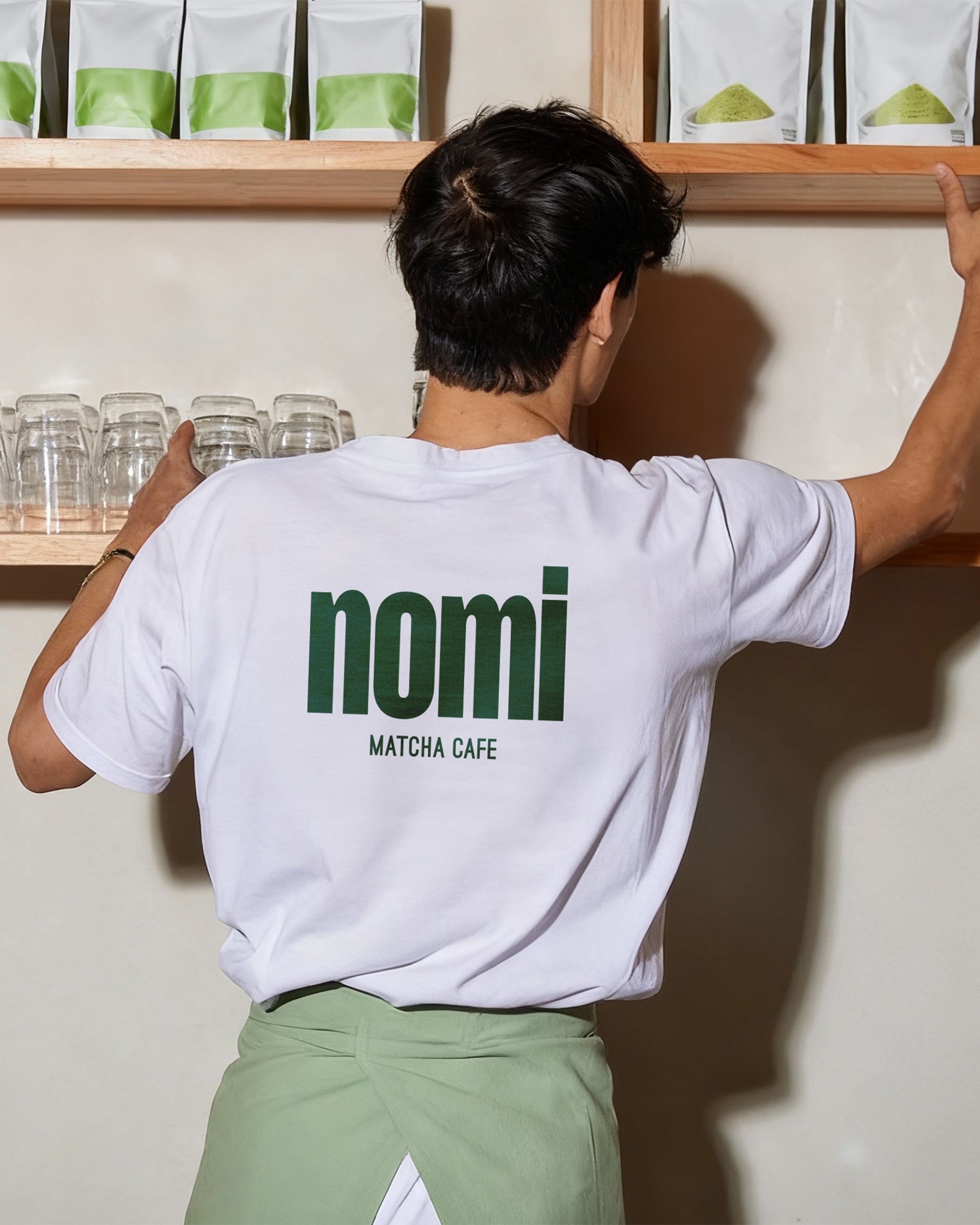
Staff T-shirt — white with green logo, maintaining a minimalist style.
Visual Identity Elements
Menu
The menu blends classic matcha drinks with signature creations like Yuzu Spark and Matcha Mojito, complemented by light desserts inspired by Japanese aesthetics.
The visual identity combines clean forms, natural colors, and subtle detailing. Concrete and metal furniture paired with offwhite accents create a calm, urban interior, while deep green provides character and evokes nature. The brand aesthetic is modern, Instagram-friendly, yet subtle and timeless.
Style and Atmosphere

Color Palette
Typography
Each color plays a key role in defining the café’s atmosphere:
Deep Matcha Green
#223a22– primary color, grounding and earthy, used across interior and printed materials.Warm Yellow
#fef9d2– soft, inviting offwhite for accents and text highlights.Fresh Light Green
#97ad5a– accent color evoking young matcha leaves.Charcoal Green Black
#0b0b0a– dark base used for text and subtle detailing.
The logo features a bold nomi wordmark in Mango Grotesque Bold, paired with the subtler tagline matcha cafe in Ostrich Sans Black. This combination gives the brand a modern yet approachable personality.

Overall, the project delivers a cohesive, recognizable identity for a space that celebrates simplicity, flavor, and the ritual of drinking matcha — presented in a contemporary, stylish way